1. Overcrowding the Design with Too Many Elements
One of the biggest mistakes designers make is overcrowding their design with too many elements. While it might seem like adding more details, graphics, and text will make the design look more interesting, the result is often overwhelming.
Why It's a Mistake:
A cluttered design can confuse the viewer and distract from the main message. It can also make the layout look disorganized, which is far from professional.
How to Avoid It:
Less is more. Use white space effectively to create a clean and balanced design. Focus on one or two key elements, and let them stand out. Ensure the message is clear and that the design is visually digestible at first glance.

2. Poor Typography Choices
Typography is one of the most important elements of graphic design. Choosing the wrong font or overusing multiple fonts can completely ruin the design's professionalism. While experimenting with fonts can be fun, it’s essential to be mindful of readability and visual hierarchy.
Why It's a Mistake:
Using too many fonts, or fonts that are difficult to read, can make the design look chaotic and unprofessional. Additionally, mismatched fonts can clash, detracting from the intended aesthetic.
How to Avoid It:
Stick to two or three complementary fonts. Choose fonts that reflect the tone of your design (e.g., a clean sans-serif for modern designs, or a serif font for more formal designs). Ensure that headings, subheadings, and body text have a clear hierarchy, making the content easy to read.
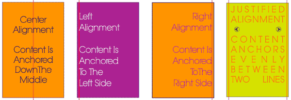
3. Ignoring Alignment and Spacing
Alignment is a crucial component of graphic design that creates structure and order. Disorganized, misaligned elements can make the design look sloppy and unprofessional. Even something as simple as inconsistent spacing can impact how polished your work appears.
Why It's a Mistake:
Misaligned text, images, or design elements can disrupt the flow of the design, making it difficult for the viewer to follow the intended visual path.
How to Avoid It:
Use grids or guides to align elements and maintain consistent spacing throughout the design. Ensure that there is enough room between text blocks, images, and other elements to give them breathing space. Good alignment makes a design look neat, organized, and professional.
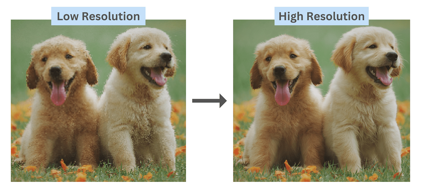
4. Using Low-Quality Images
High-resolution, professional-quality images are essential for any design project. Using pixelated, stretched, or low-resolution images can diminish the overall quality of the design, no matter how great the concept might be.
Why It's a Mistake:
Low-quality images can make the entire design look unprofessional and amateurish. They can also become pixelated when resized, which detracts from the visual appeal and can confuse your audience about the credibility of your brand or message.
How to Avoid It:
Always use high-resolution images, especially for print design. For web design, ensure that images are optimized for fast loading without sacrificing quality. If you can’t afford professional stock photos, consider using free high-quality resources like Unsplash or Pexels.
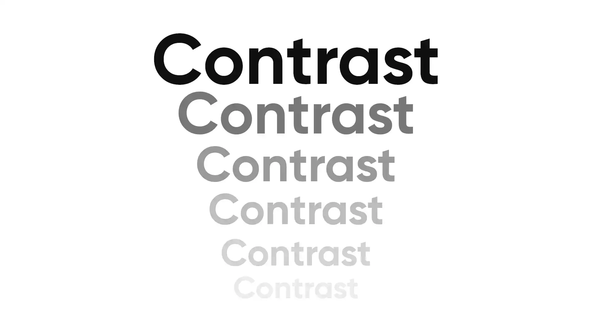
5. Neglecting the Importance of Contrast
Contrast is essential for creating emphasis and making certain design elements stand out. Without enough contrast between text and background, or between different elements in your design, viewers may struggle to discern the content or navigate the design.
Why It's a Mistake:
Insufficient contrast, especially between text and background, makes the design hard to read and visually unappealing. A lack of contrast can make your design look flat and fail to capture the viewer's attention.
How to Avoid It:
Ensure there is adequate contrast between text and background colors. Light text on a dark background or dark text on a light background works well. Additionally, use contrast to highlight the most important elements of your design, guiding the viewer’s eye to key information.