Common Website Design Mistakes and How to Avoid Them

Introduction
When it comes to website design, even the smallest mistakes can have a significant impact on user experience, search engine ranking, and conversion rates. Whether you’re designing your own site or working on a client project, being aware of common design pitfalls can help you create a more effective and professional website. In this blog post, we’ll explore some of the most common website design mistakes and provide actionable tips on how to avoid them.
1. Overcomplicating the Design

Mistake: Overly complex designs with too many elements, such as cluttered layouts, excessive colors, and unnecessary animations, can overwhelm visitors and distract them from the main message.
How to Avoid It:
- Embrace simplicity: Keep your design clean and focused. Use whitespace strategically to allow elements to breathe and make the content easier to digest.
- Prioritize functionality: Think about the user’s goals first—whether it’s making a purchase, learning about your brand, or contacting you. Design around those goals.
- Limit color palette: Stick to a small, cohesive color palette (usually no more than 3-4 primary colors) to maintain visual harmony.
2. Poor Navigation and Usability
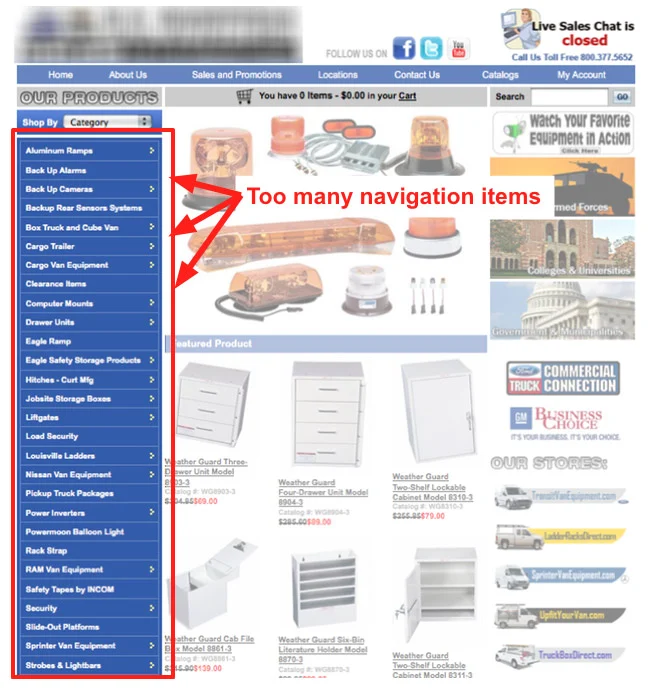
Mistake: Complicated or unintuitive navigation can frustrate users and lead them to leave the site quickly. Websites with too many menu items or hidden options can make it difficult for visitors to find what they need.
How to Avoid It:
- Use clear and concise labels: Ensure your navigation menu is easy to understand and labels are specific (e.g., “About Us” instead of “Company”).
- Stick to a logical structure: Group related pages together, and try to limit the number of clicks needed to get to important content.
- Mobile optimization: Ensure the navigation is just as easy to use on mobile devices. Consider using a hamburger menu or other mobile-friendly options.
3. Ignoring Mobile Optimization
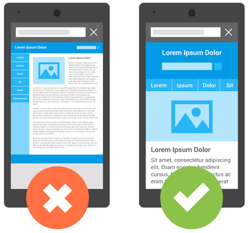
Mistake: With an increasing number of users browsing websites on mobile devices, neglecting mobile optimization can harm the user experience and lead to high bounce rates.
How to Avoid It:
- Responsive design: Ensure your website adapts seamlessly to different screen sizes, whether it’s a phone, tablet, or desktop.
- Test on multiple devices: Regularly test your site on various mobile devices to check how it looks and functions.
- Prioritize mobile load speed: Mobile users tend to expect fast loading times. Optimize images and minimize large files to improve performance.
4. Slow Loading Times

Mistake: Websites that take too long to load are a major turnoff for visitors and can lead to lost sales and lower search engine rankings. Large images, videos, or unnecessary plugins can slow things down.
How to Avoid It:
- Compress images: Reduce the file size of images without sacrificing quality by using tools like TinyPNG or ImageOptim.
- Minimize HTTP requests: Reduce the number of elements on your page (scripts, images, etc.) to improve load speed.
- Leverage caching: Use browser caching to store some parts of your website on a user’s device, which speeds up future visits.
5. Poor Typography Choices

Mistake: Choosing fonts that are hard to read, too small, or inconsistent across your site can make your content difficult to consume and harm the overall design aesthetic.
How to Avoid It:
- Pick readable fonts: Choose fonts that are legible on all devices. Stick to web-safe fonts like Arial, Helvetica, or Google Fonts for variety and accessibility.
- Ensure sufficient contrast: Text should have enough contrast against the background to ensure readability. Avoid using low-contrast color schemes, like light gray on white.
- Maintain consistency: Limit the number of fonts used on a page (ideally 2-3). Use them consistently across headers, body text, and buttons.
6. Failing to Include Clear Calls to Action (CTAs)
Mistake: A website without clear CTAs can leave users uncertain about what to do next, which can reduce conversions. If your visitors don’t know how to take the next step, they may leave without interacting further.
How to Avoid It:
- Make CTAs prominent: Use buttons or links that stand out visually, with contrasting colors and action-oriented text (e.g., “Get Started” or “Buy Now”).
- Place CTAs strategically: Ensure your CTAs are easy to find, whether it’s in the navigation menu, at the end of a blog post, or above the fold on the homepage.
- Use clear language: Avoid vague or unclear CTA text. Be specific about what you want the user to do next.
7. Neglecting SEO Best Practices

Mistake: Designing a beautiful website that isn’t optimized for search engines means that even the best design may not be seen by as many people as possible. Without good SEO, your website can be invisible to search engines, reducing your visibility online.
How to Avoid It:
- Optimize for keywords: Conduct keyword research and use relevant terms in your page titles, meta descriptions, headers, and content.
- Use alt text for images: Search engines can’t “read” images, so use descriptive alt text for each image to improve your SEO.
- Ensure fast load speeds: As mentioned above, site speed is a key ranking factor for Google. A slow website can hurt your SEO performance.
8. Not Testing or Gathering User Feedback

Mistake: Launching a website without proper testing or user feedback can result in missed opportunities for improvement. What works in theory may not work in practice.
How to Avoid It:
- Conduct user testing: Before launching your site, test it with real users. Use tools like Hotjar or Crazy Egg to track user behavior through heatmaps and recordings.
- A/B testing: Run experiments to compare different versions of pages or design elements to determine what performs best with your audience.
- Solicit feedback: Regularly gather feedback from users or clients to ensure the design is meeting their needs and expectations.
9. Not Updating or Maintaining the Website

Mistake: Launching a website and then neglecting it can lead to outdated content, broken links, and a poor user experience.
How to Avoid It:
- Schedule regular updates: Continuously update your content, security patches, and design elements to keep your website fresh and functional.
- Check for broken links: Periodically test your site for broken links or missing pages that could frustrate visitors.
- Monitor performance: Keep track of your website’s performance, load times, and SEO rankings to make adjustments as needed.

Conclusion
Avoiding these common web design mistakes can make a huge difference in the success of your website. By focusing on user experience, simplicity, mobile optimization, and effective calls to action, you can create a site that not only looks great but also performs well. Remember, design is an ongoing process—test, learn, and adapt to create the best possible experience for your users.
What other design mistakes have you encountered? Share your thoughts in the comments below!